One challenge I found myself coming back to over the years was the gap between what I'd designed and what eventually made it into the product. It wasn't that Engineering were building poor experiences, and it certainly wasn't a lack of effort. More often than not it came down to how I was communicating my intent.
Depending on the project, I'd hand over either static Figma screens or interactive prototypes, then walk the team through the feature. We would discuss interactions, edge cases, animations and component behaviour, and I'd annotate anything that I thought might not be immediately obvious.
The problem was that a lot of those details lived in conversations. If something wasn't written down, or an annotation was missed, there was a good chance it would be interpreted differently by the time development started. Even with a mature component library, I found less experienced front end engineers would occasionally recreate components or simplify interactions rather than use what already existed.
The issues were rarely major. They were the small things that elevate the experience. Component states, transitions, loading behaviour and micro-interactions. They were also the things I was repeatedly picking up during design QA, despite discussing them weeks earlier.
I started questioning whether static designs were still the best way to communicate increasingly interactive products.
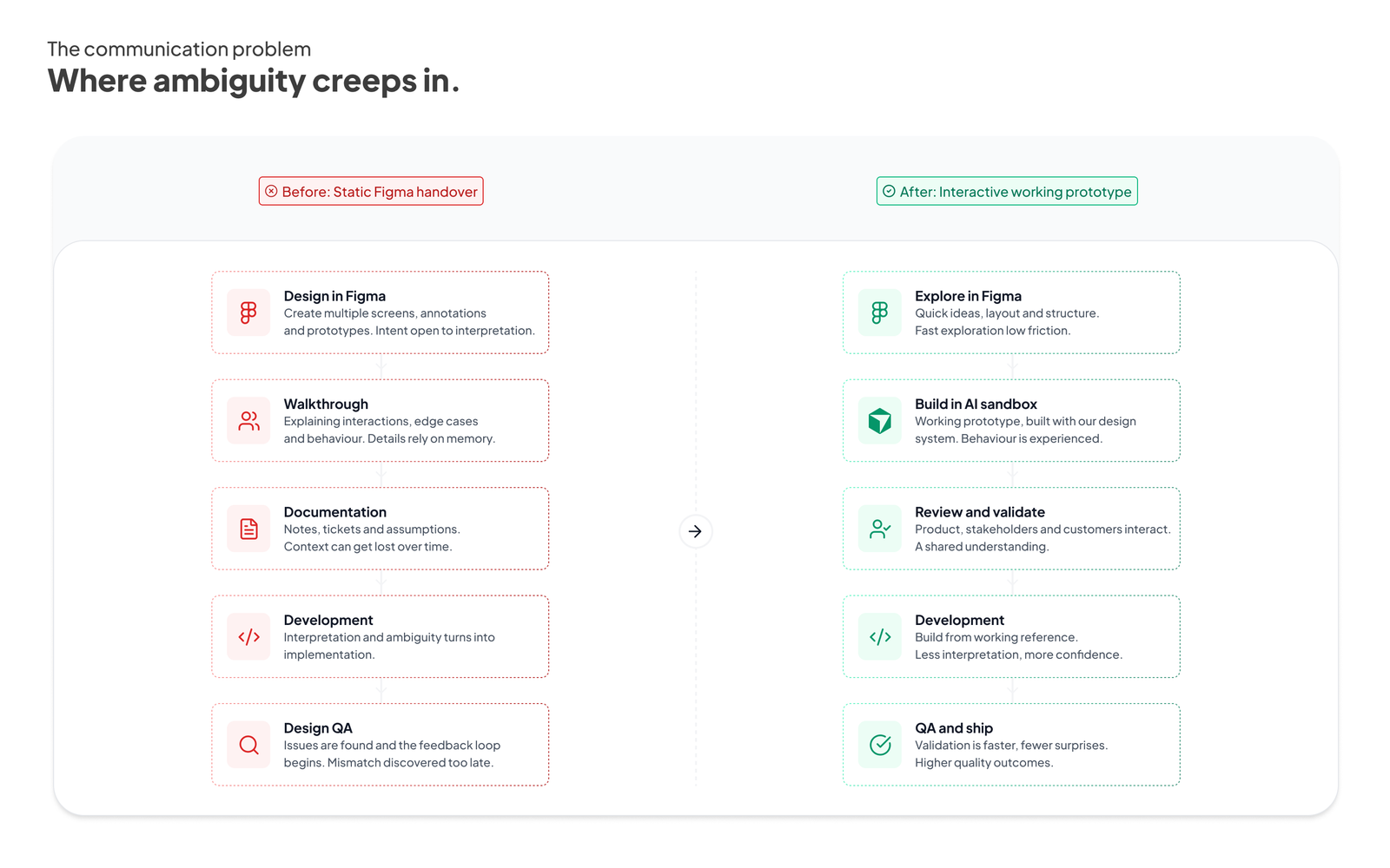 Intent can often be lost between handover and implementation. The sandbox removed ambiguity and created a shared understanding.
Around the same time, AI coding tools started becoming genuinely useful.
Initially I approached them the same way many designers did. I saw them as a quicker way to prototype ideas. It didn't take long to realise that speed wasn't actually the biggest benefit.
The more interesting shift was that I no longer had to describe how something should behave. I could build it.
Rather than relying on walkthroughs and annotations, I could hand Engineering a working version of the interaction. Instead of imagining how a transition should feel or how a particular flow should work, they could experience it themselves.
That was the point where I realised this wasn't really about prototyping anymore. It was about communication.
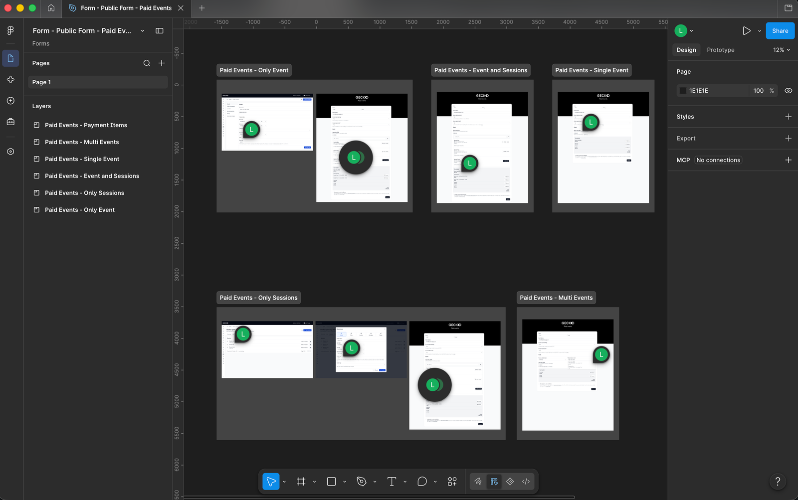 Figma doesn't always show intent - micro-interactions and animated flows are hard to convey through flat graphics and annotations alone.
I created a dedicated sandbox environment built around our React component library. Every prototype used the same components, tokens and interaction patterns that existed in the product, meaning prototypes looked and behaved consistently from the outset.
The sandbox quickly became much more than somewhere to experiment with ideas. I used it throughout discovery, to explore different approaches with Product, demonstrate concepts to customers and provide Engineering with a much richer handover than a collection of static screens ever could.
One unexpected benefit was that it also became a genuine source of truth. Engineers could inspect how a component behaved, understand the interaction, and in many cases lift portions of the implementation directly into production. Instead of translating a design into code, they were refining something that already existed.
The conversations changed as well. We spent less time discussing what something should do, and more time discussing whether it was the right solution.
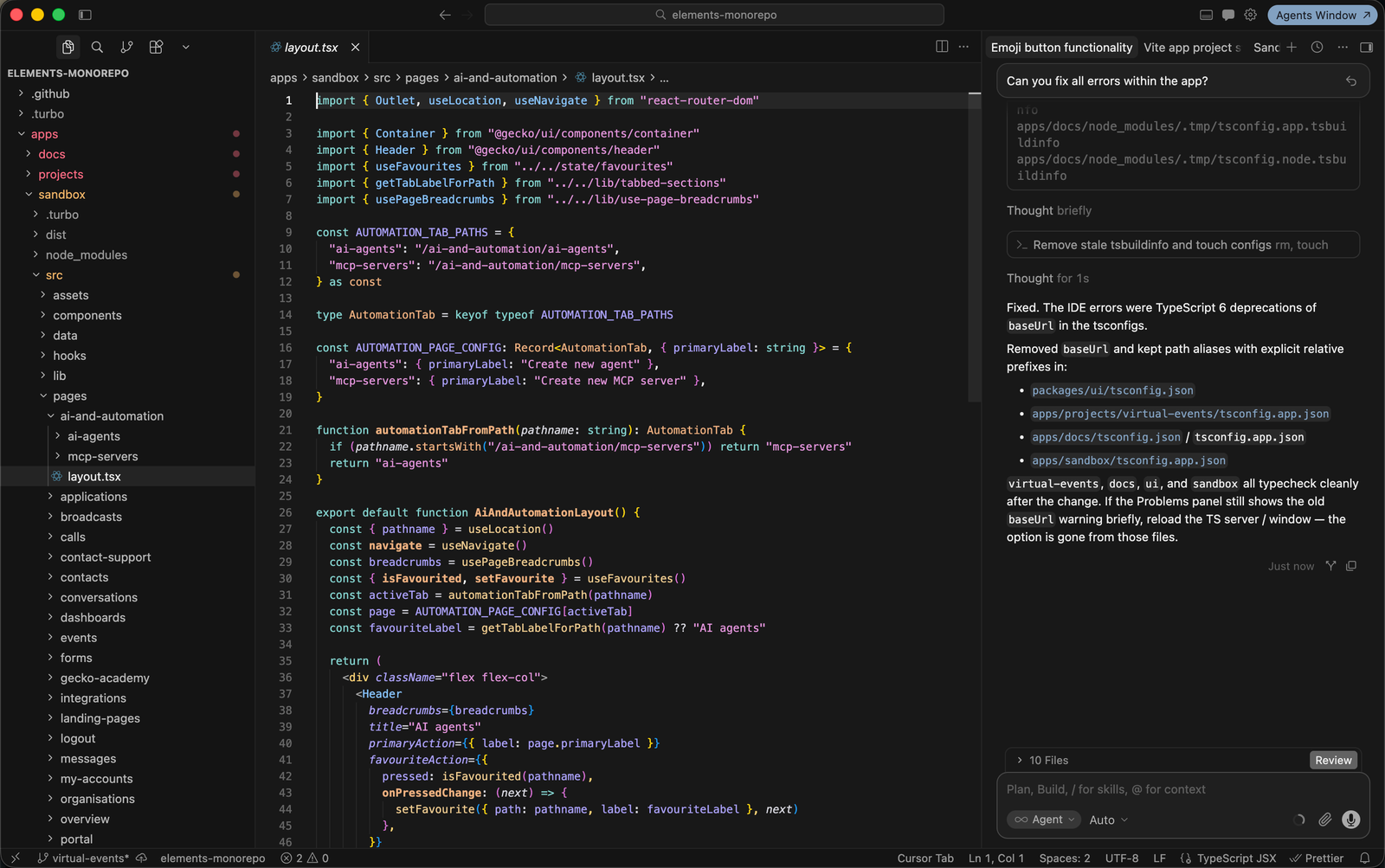 The sandbox environment, built on the same React components, tokens and interaction patterns as the product.
One project in particular highlighted the value of this approach.
We were exploring a new dashboard experience for customers. Given the number of modules within our platform, and the fact every institution uses a different combination of them, presenting meaningful information is a difficult problem.
Our initial direction centred around a dashboard made up of charts, cards and key metrics. We built a working prototype and put it in front of customers early. The response was generally positive, but the feedback was surprisingly consistent.
"It looks good, but a lot of this isn't particularly relevant to me."
Our first instinct was to explore a fully customisable dashboard, allowing each customer to choose exactly what they wanted to see. Technically it was possible, but it would have required months of development to expose every available data point.
Because we already had a working prototype, it became much easier to step back and challenge the assumption entirely.
The problem wasn't that customers wanted different dashboards.
They wanted answers to different questions.
That insight completely changed the direction of the project. Rather than investing months building increasingly configurable dashboards, we pivoted towards a conversational experience where an AI agent had access to the customer's account and could answer questions based on their own data.
Looking back, I think there's a good chance we would have built the wrong product if we'd only validated static designs.
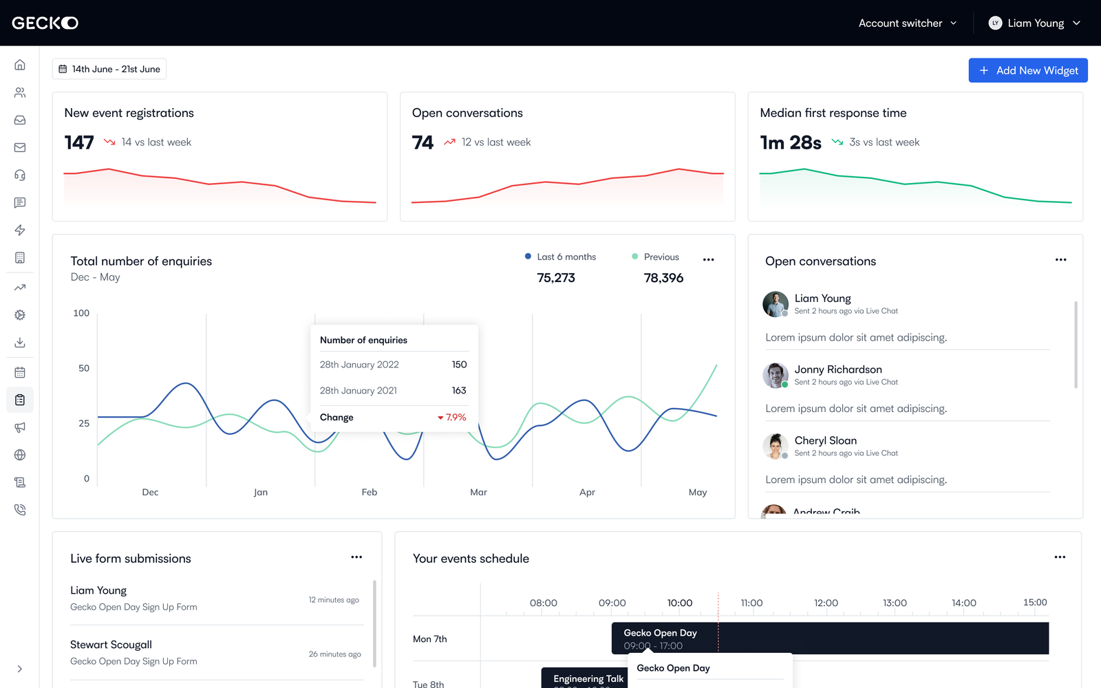 The original dashboard prototype we put in front of customers - the feedback that reshaped the direction of the project.
The sandbox wasn't without its frustrations.
Early on, Cursor regularly ignored existing components and generated new ones that solved the same problem slightly differently. At first it felt like a limitation of the tooling, but it quickly became clear the bigger issue was our documentation.
Like many design systems, ours relied on a lot of shared understanding. Engineers who had worked with it for years knew the conventions, the preferred patterns and the unwritten rules. AI didn't.
That forced us to rethink how the design system was documented. Rather than simply listing components and their APIs, we documented the judgement behind them, capturing design principles, component selection guidance, accessibility rules, implementation constraints and product patterns. We organised this into a central AI knowledge base with dedicated documentation for each component, making documentation a core part of the design system instead of an afterthought.
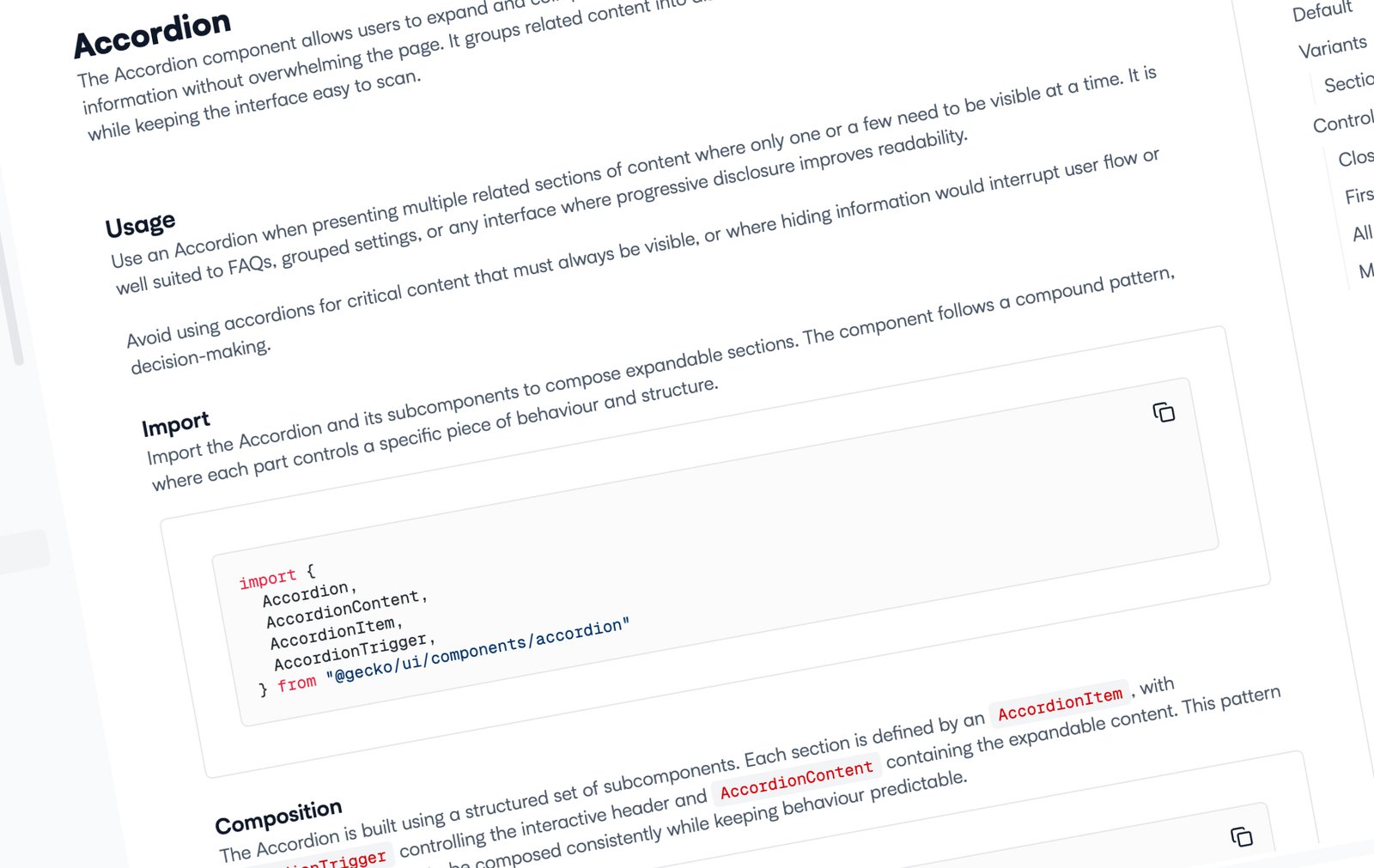 Improved design system documentation - clearer rules and guidance that helped both AI and engineers use components consistently.
Perhaps the biggest change wasn't the sandbox itself, but how it influenced my design process.
I still use Figma every day, but its role has changed. It's where I sketch ideas, explore concepts quickly or work through something during a call. Beyond that, I increasingly find myself moving into the sandbox because it gives me confidence that a solution actually works rather than simply looks right.
As designers we're good at solving problems, but we're not always right first time. Flat visuals can only tell you so much. A working prototype allows you to experience the flow, question your own assumptions and uncover simpler solutions before Engineering invests time building them.
It has also changed the quality of conversations I have with Product, Engineering and customers. Rather than asking people to imagine an experience, I can put it in front of them and gather feedback from something that behaves much closer to the final product.