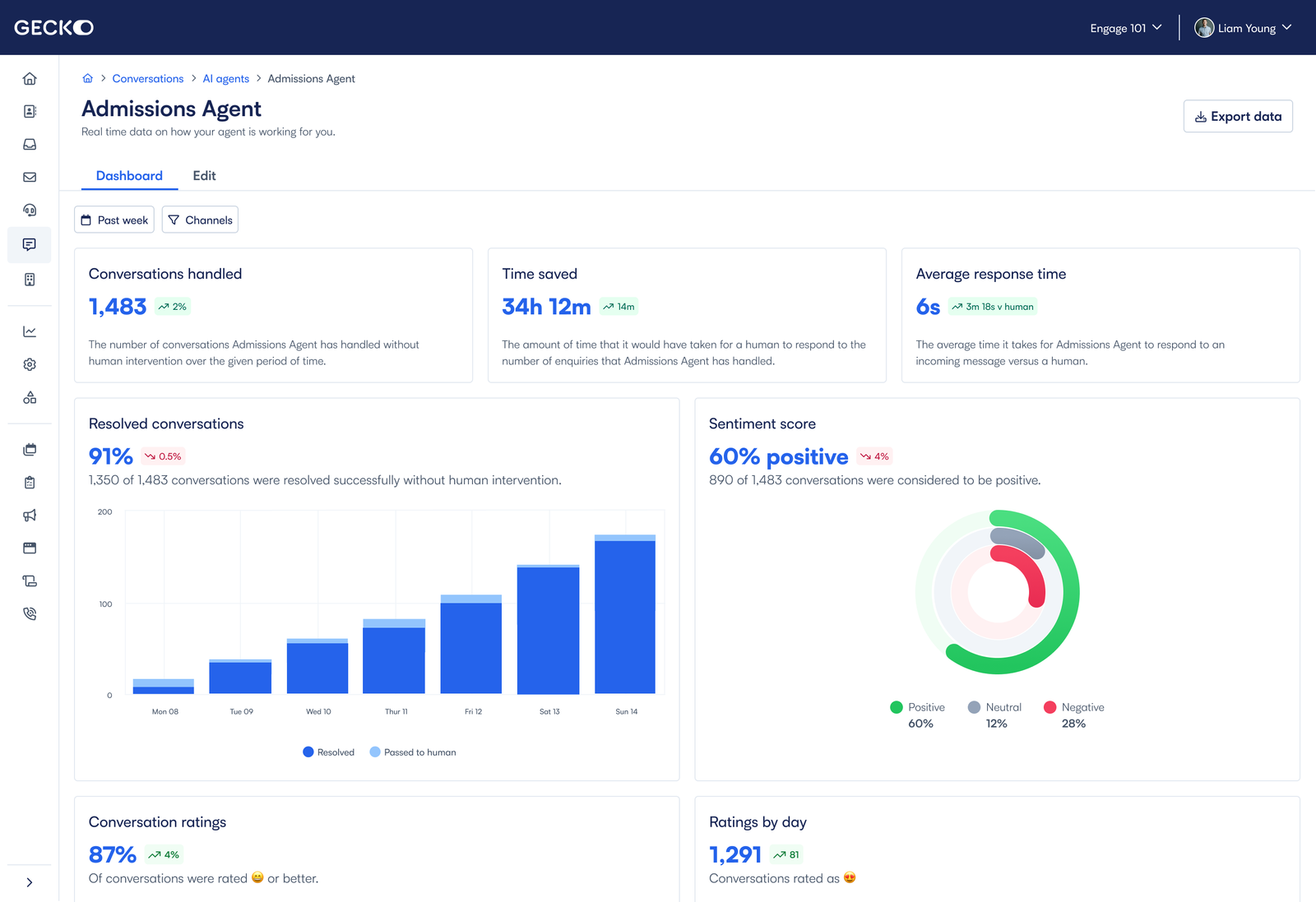
 A snapshot of the new dashboard.
Our AI chat agent had quietly become one of Gecko's most effective tools. It was resolving student queries instantly and freeing up a ton of staff time. But because it just ran smoothly in the background, it kind of faded from view. Administrators trusted it and liked it, but leadership teams stopped seeing evidence of what it was actually doing. When renewal time came around, that lack of visibility made it tough to justify the spend. Despite the fact that it was performing really well, churn was going up. Not because people were dissatisfied, but because the product's value just wasn't visible or being communicated.
To figure out what was going on, we talked to both customers who'd churned and ones who were still active, and did some competitive research. Three things really stood out:
We also worked with engineering to dig through existing data, and we found some untapped metrics like escalation rates, customer satisfaction scores, and cost per conversation—really powerful signals we just weren't surfacing yet. The challenge became pretty clear: make the invisible visible by turning data into a story that leaders could quickly understand and trust.
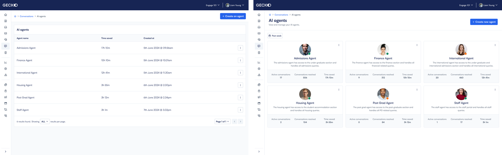 A side by side showing how the old table list looked against a more engaging card view - adding personality.
I took on the full design of a new ROI dashboard from the ground up. The old one was just a static table that nobody really engaged with, so I wanted to replace it with something dynamic that people would actually want to use. My main goal was making the value obvious and giving administrators an easy way to communicate impact.
I split the dashboard into two layers. The first one had card-style summaries showing surface level stats such as active conversations, number of conversations handled and the time it has saved - this gives the user an instant temperature check of the agents. The second layer had more detailed dashboards that pulled together operational, quality, and financial data.
I put simple summaries next to each visual so users could quickly turn what they were seeing into talking points. I built a React prototype and tested it with cross section of administrators from different universities. Their feedback shaped a lot of the final product. Human comparisons, and trend analysis all came from those sessions, while we had to make a product decision on whether to include elements such as forecasting - it was felt that it was not necessary at this stage, and it was more important to get the core data on display first and foremost.
My design principles were pretty straightforward:
Throughout the whole process, I worked with the product team to nail down success metrics around retention, and with engineering to make sure we were using reliable datasets and charting libraries. What we ended up with made performance really hard to miss.
"We finally have something to show leadership and it’s so obvious how much time and money the bot saves."
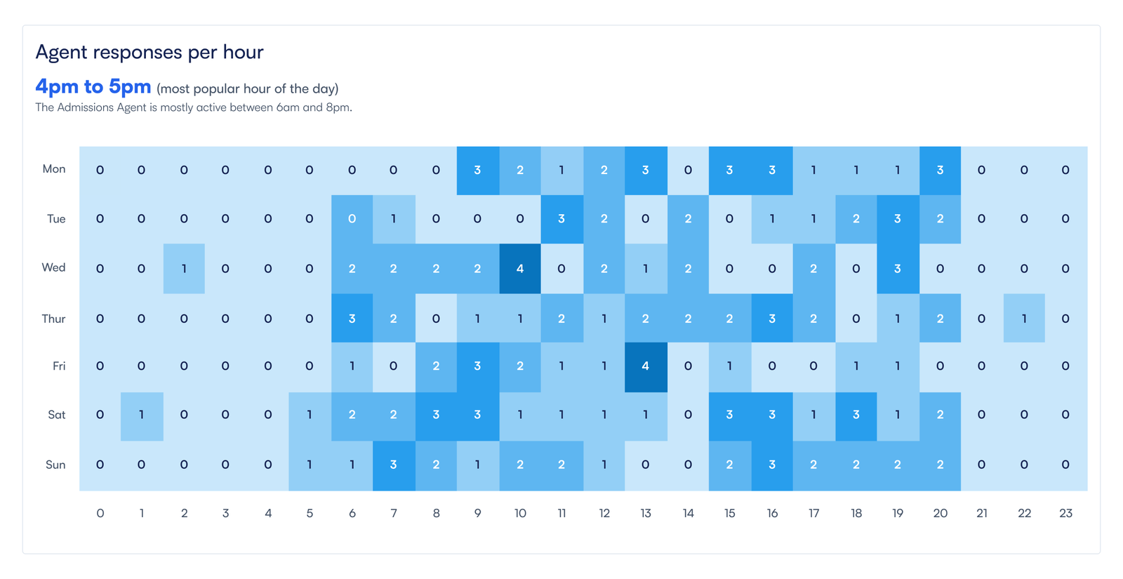 The new agent response time chart, detailing the times when the agent is handling conversations. After 6 months, our data suggested most agents handled converstations out of hours.
Six months after we launched, the results proved the approach worked. By turning all that data into an actual story, I helped administrators make a strong case for the product internally. Renewals stopped being about justification and started being about showing real ROI.
This project really showed me how design can drive actual business outcomes by changing how people perceive value. When the value is clear and obvious, retention tends to follow.
I'm now working on extending the dashboard to include the previously discarded forecasted data as well as industry benchmarking, so customers can compare their performance to peers and strengthen our own position as industry leaders even further.
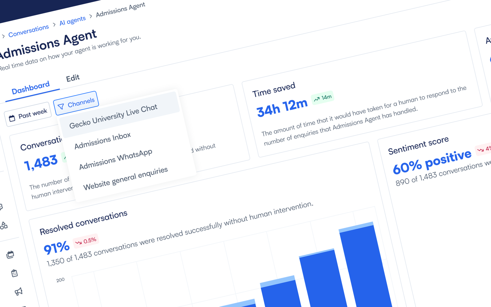 Users can filter by channel, allowing them to see how the agent is performing across an institutions various communication streams and compare their effectiveness.