Gecko Engage Menu
The Gecko platform is...massive! Our software contains 7 modules spread across two different platforms. Each module contains a lot of functionality and settings. And as the company grew quickly the focus was on features, features and more features, this in turn bloated the platform and the complexity increased.
As the Senior Product Designer at Gecko, I am responsible for ensuring our customers' daily work lives are made easier and more efficient but I felt we’d gotten away from that.
So, while on a call with some customers we performed a quick straw poll, asking the question of what was of most importance to them.
Every single customer chose the option of “speed and efficiency”.
I wanted to get us back on track…
What did we decide to do?
Equipped with this knowledge, myself and our Product Manager sat down together and started looking at areas we could tackle to make our customers' experience that little bit better.
There were a ton of things in the backlog that we could have looked at but the issue was that the majority of them would only improve the experience for users with specific modules, and not every customer has every module.
Step forward, the product menu! We knew it was far too large, and that the order was off. Further, we hide some key features deep in the settings, which forces the user to dig deep to find what they are looking for.
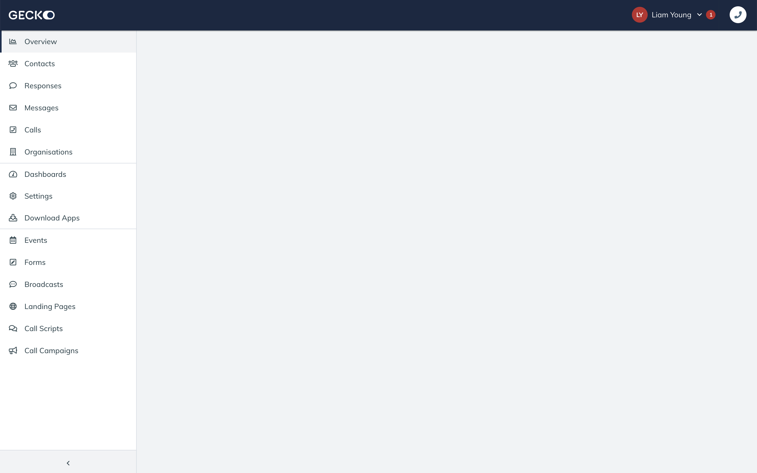 The current Gecko menu.
Our hypothesis
“We believe that by streamlining the menu, and by serving important settings depending on which module you are viewing, will lead to better engagement, more efficiency and ultimately users will get tasks done quicker. This in turn will lead to greater customer satisfaction with the product”
The need to tread carefully
While we know that this wasn’t a massive task for product and engineering, we are acutely aware that this is a big change for our users and our customer success team. Many customers have created training guides for staff and we have our own knowledgebase to consider.
Thankfully, our customer success team was fully on board. Seeing the positives that this would bring to the customers experience but also recognising that this may lead to less enquiries to the customer success team on “how to”, allowing them to focus more on helping customers grow with the product.
What was done?
First we dived into Pendo, our product analytics tool. This gave us valuable insight into which menu items were most frequently clicked, and by which customer account. This allowed us to identify which menu items we should call out most - it came as no real surprise that events and forms were the most clicked as these are our most popular products. Contacts and responses were also heavily clicked as this is the area where customers manage their data. These, alongside settings, were the most clicked items, but the problem is that they are in no real order and are muddled up with other items that aren’t receiving as many clicks.
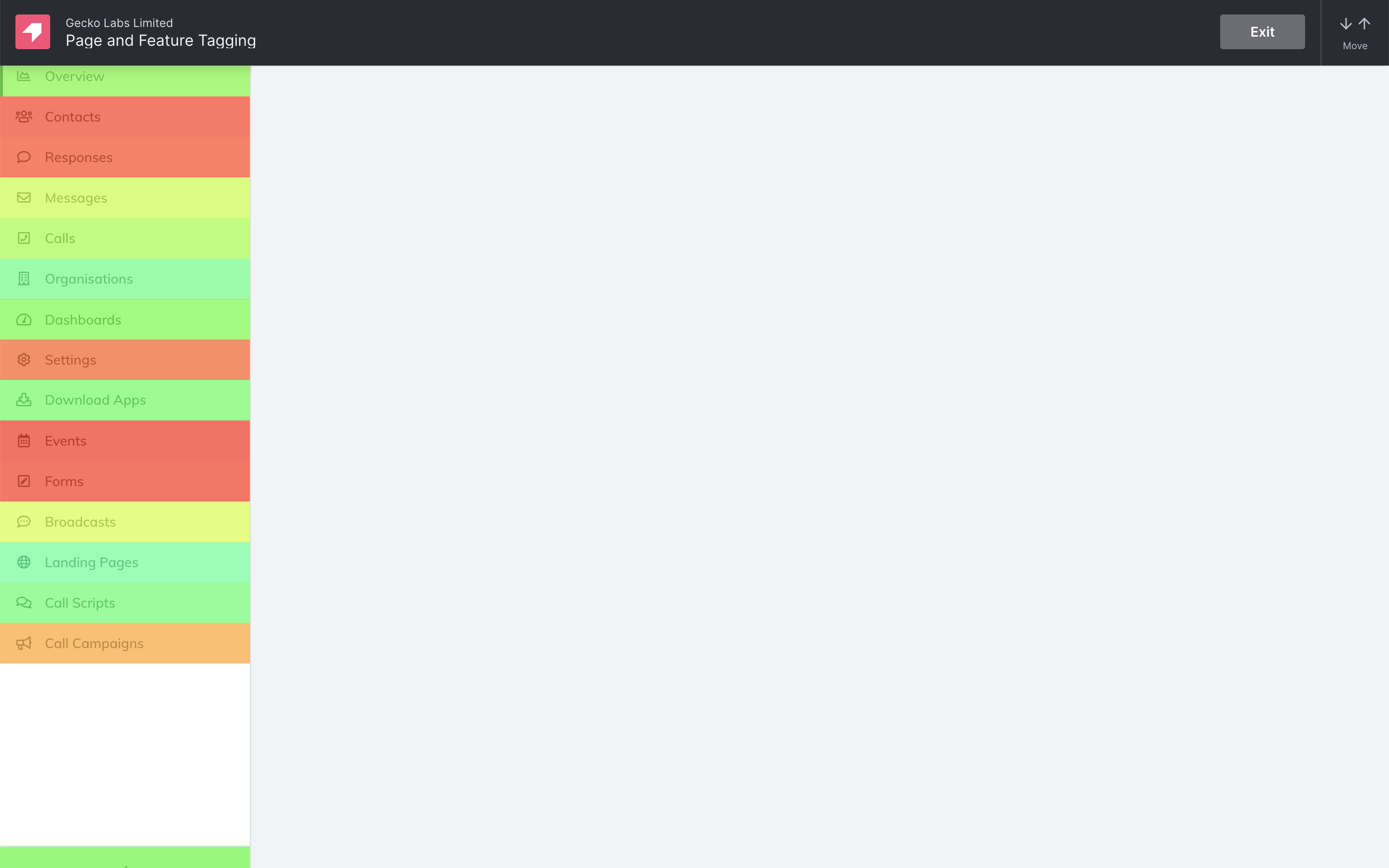 A heatmap of the Gecko menu, showing that key menu items aren't the focus and are muddled.
We decided we wanted to shape the menu around the modules, and alongside the Product Manager and a member of Customer Success, we started highlighting all the key areas within the modules on a spreadsheet, our menu was starting to take shape.
Our next step was to then attribute key settings to each of the 7 modules, using the data we extracted from Pendo. This would give the user quick and easy access to the most important settings.
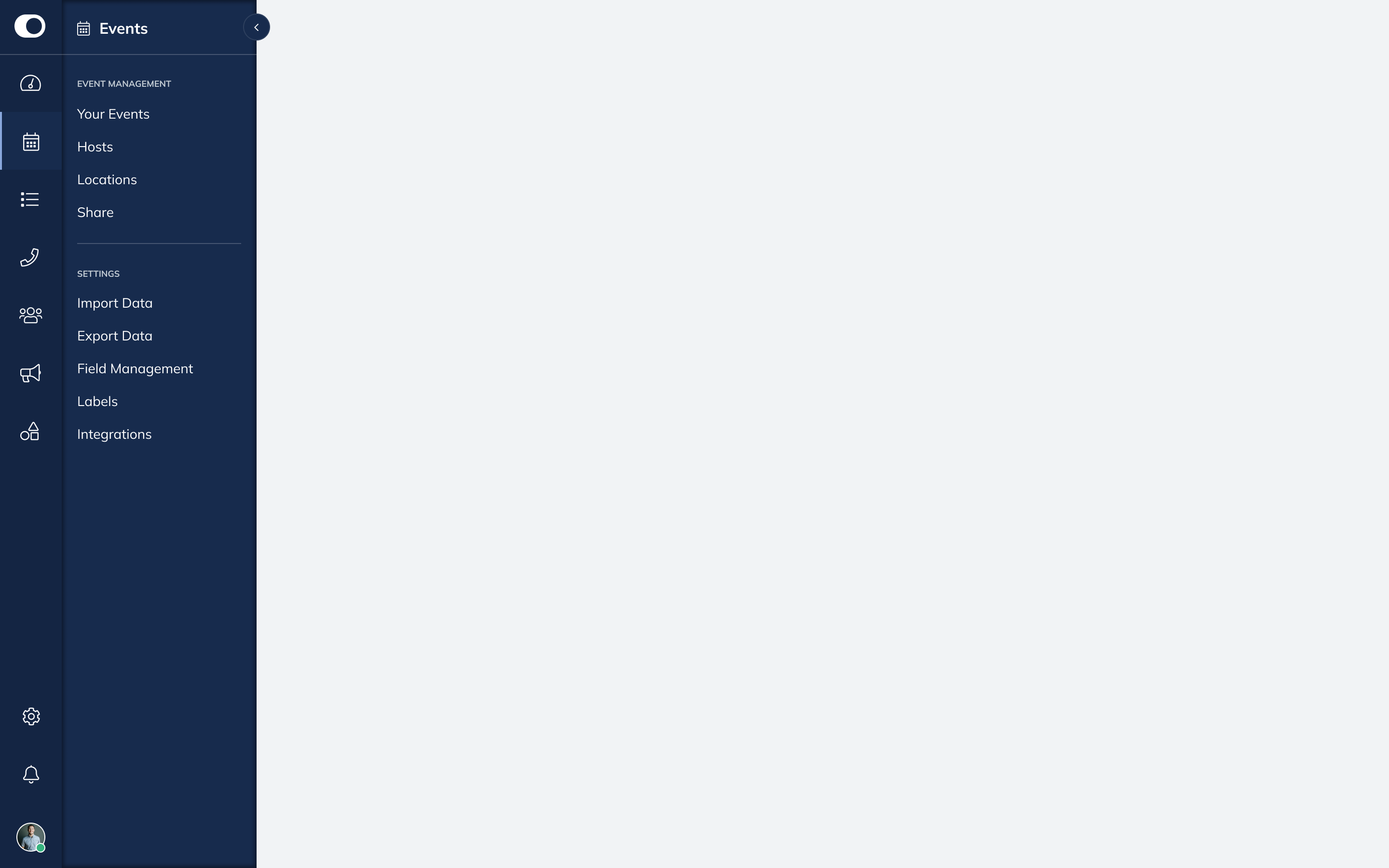 The new proposed Gecko menu. Modules are the main path into the product and key settings are highlighted within.
Outcome & results
The outcome of the project is a cleaner and easier to use menu, surfacing the key areas users find themselves in when working within specific modules.
We are also undergoing a complete product refresh so the new menu has received a facelift in keeping with the new direction. We have also gained some UX wins in the process.
- The collapse is now a lot more prominent and not hidden at the bottom of the page
- With the removal of the header we generate more vertical space
While this has yet to hit production (it’s forming the first stage of our product refresh which is coming up real soon), we have run testing workshops via Maze with some key clients. We set out various challenges within Maze and have had some really great results. Feedback has also been largely positive, with most users commenting that this will definitely make their workflow better.
One great piece of feedback was having the ability to pin key settings, this is definitely something we will run through discovery once the menu is released.