Gecko Chat Search Improvements
 A more engaging search experience.
Our Chat product has had a lot of focus in recent months as we look to really grow (and sell) the product more. Our sales and customer success team in particular have really been knocking it out the park.
Usage of the platform is increasing month on month, but also, the complexity of usage has grown with it. Our customers have been expanding the product across multiple teams within the institutions, which has thrown up some weaknesses within the product - most notably the ability to search.
What’s the problem?
The problem with our search capability is two fold really.
- The user experience around searching and how the results are presented is poor. We provide a limited number of criteria in which you can search by.
- We are missing a key piece of functionality in that our users can’t do anything with their search results.
 Poorly presented, and unmanageable search results.
Our hypothesis
"If we can provide a more robust means of searching, alongside a means of actioning results then our customers can ensure conversations are dealt with in a quicker fashion and by the team best positioned to deal with the enquiry."
Research, research, research
My first port of call was to speak to our wider product team and set about speaking with our more ‘heavy usage’ customers. I had a decent grasp of what I could do when it comes to improving the search having used many products with brilliant search capabilities but the missing piece for me was digging deeper on what exactly our users wanted to do with the results.
Through a series of customer interviews I discovered a broad range of use cases. Customers ultimately want to:
- Assign conversations on a particular subject (such as admissions) to certain teams or agents.
- Close older conversations without the need for doing so one by one.
- Tag conversations, again based on a particular subject matter.
- Export conversations which helps customers provide important data to their management, in particular ROI.
The solution
The first port of call for us was again to get together as a team - myself, our product manager and lead engineer for the Chat product - and map out the expected user flow. This allowed us to identify any pitfalls early and ensure that all implications, from both users and engineering point of view, were considered.
Armed with the finalised flow, I headed to my safe space…Figma 😅.
Some of the key UX improvements were:
Reposition search input
Currently, the search input it sits in the sub-header, where it’s really unclear if it is a global search or a means of searching on just that page.
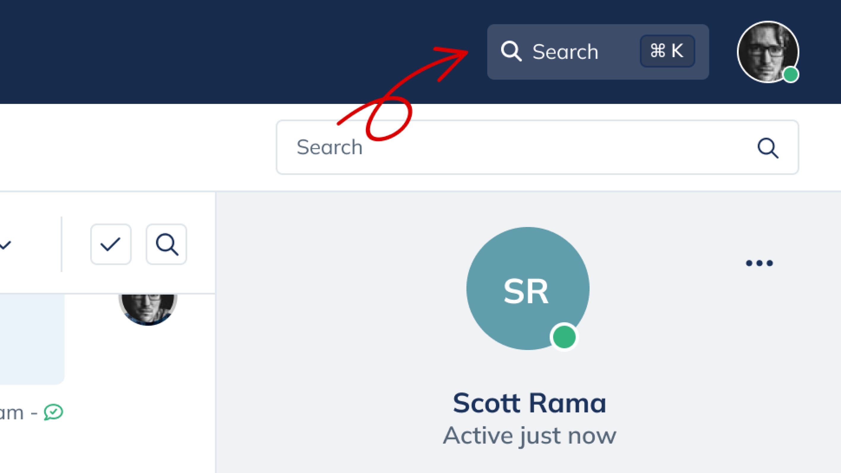 Search input placement moved from sub-menu to main menu header bar.
Shortcuts
In-keeping with our mantra of ensuring our customers have the most efficient working practices we introduced shortcut commands, CMD + K is introduced as a means of quickly searching.
 Users can access search much quicker by using keyboard shortcuts.
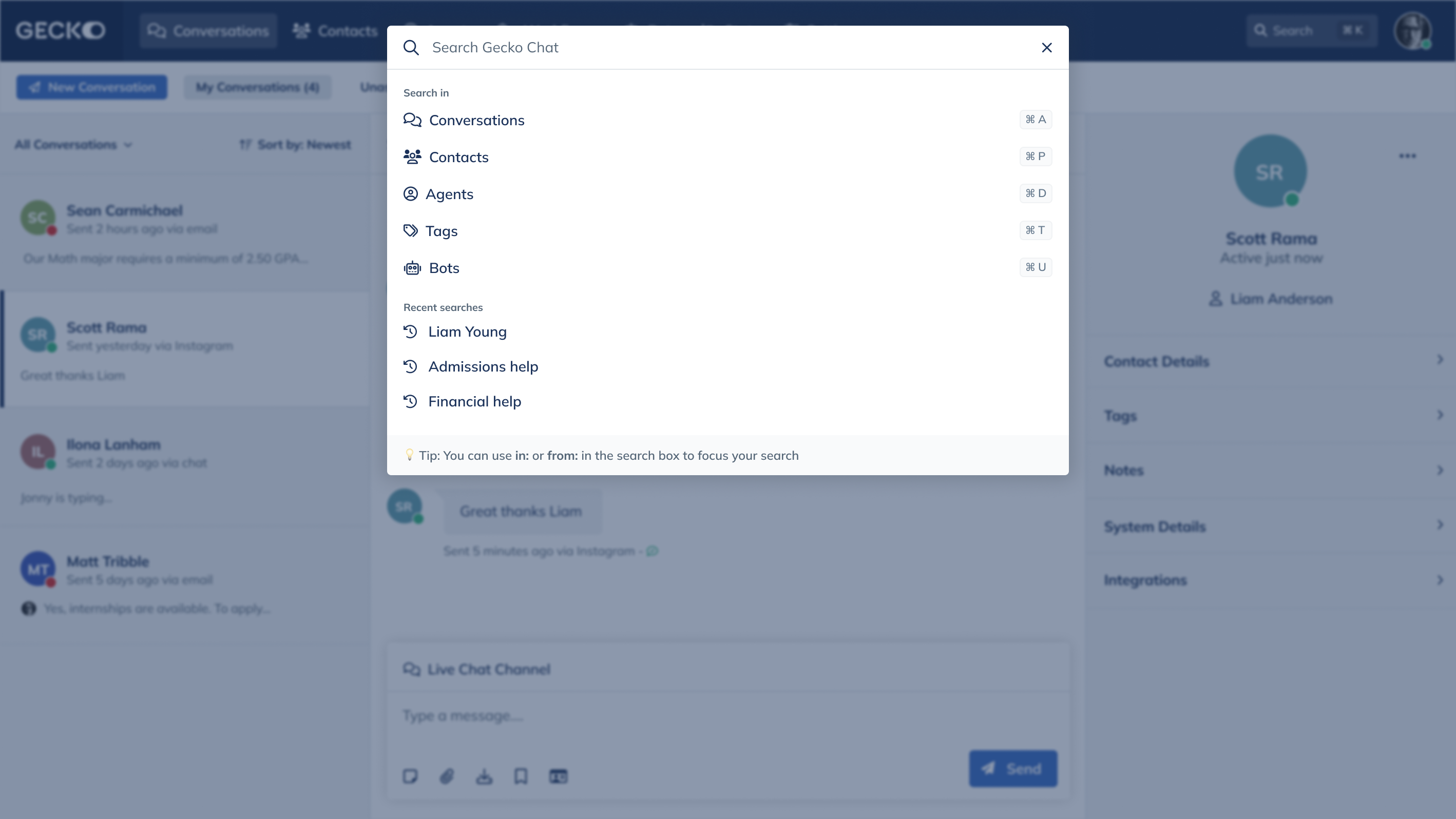
Engaging search
A more robust searching experience. This included the ability to pre-filter your search results, for example you could search within Conversations and specifically search within Channels or from certain individuals. We will also surface recent or frequent searches to the user. I also love the randomised tips suggested to the user 😍.
You can now dive deeper into searching by pre-filtering results.
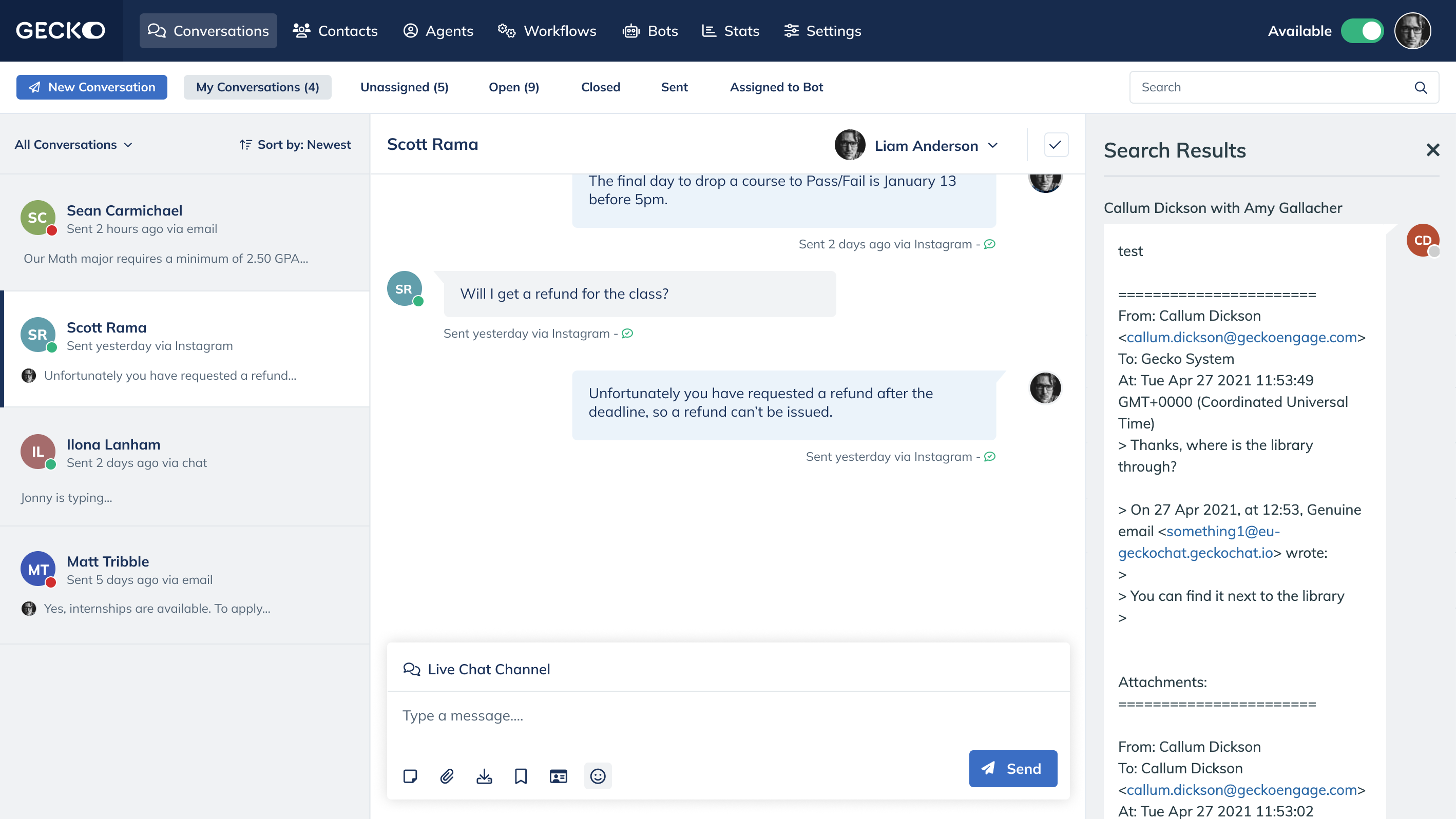
Search results page
The search results now have their own dedicated page instead of the restrictive right hand panel view. This opens up so many possibilities when it comes to actioning search data!
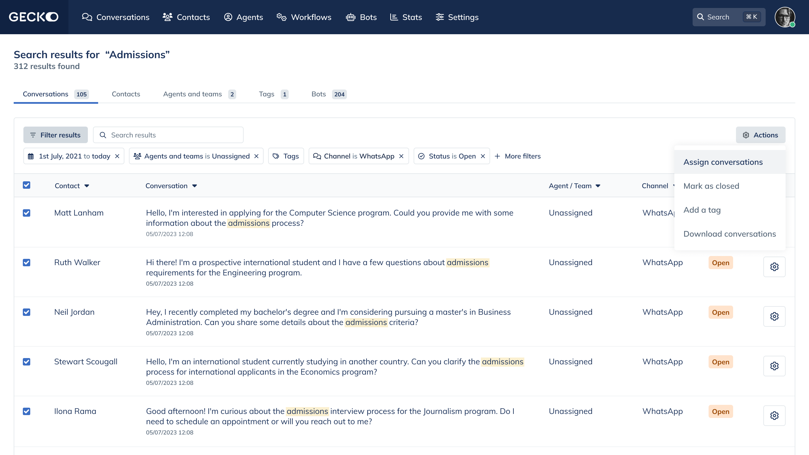 The search results page has been vastly improved, data can now be actioned.
On the search results page:
- Search results are broken down into individual areas such as Conversations, Agents, Contacts etc. The reason for this is that there are different actions you can perform for each individual area, so having a table of mixed results wouldn’t make much sense.
- Search results are displayed in table format for ease of scanning, filtering, sorting and actioning.
- Results can be filtered, allowing the user to really drill down to the data they require.
- When you select results, an actions menu appears. This allows the user to action their chosen results depending on which area they have searched in.
Customer feedback
All the way throughout this project we have liaised with our customers, and following a series of demo’s with customers the feedback has been amazing. We have really hit the right tone with the proposed solution and I cannot wait until it is in the hands of our customers!
I really believe this project will have a significant impact on our Chat users daily lives. And that’s why we’re here, isn’t it?